Full Story
BeyondOrbit
How can design persuade people to try new experiences?
Year
2024
Category
UIUX / Service Design
Exploring Speculative Design Approach to Persuade and Inspire New Experiences.
A research-driven exploration of how design can reshape public perceptions of space tourism, addressing psychological barriers to encourage new experiences.
Context
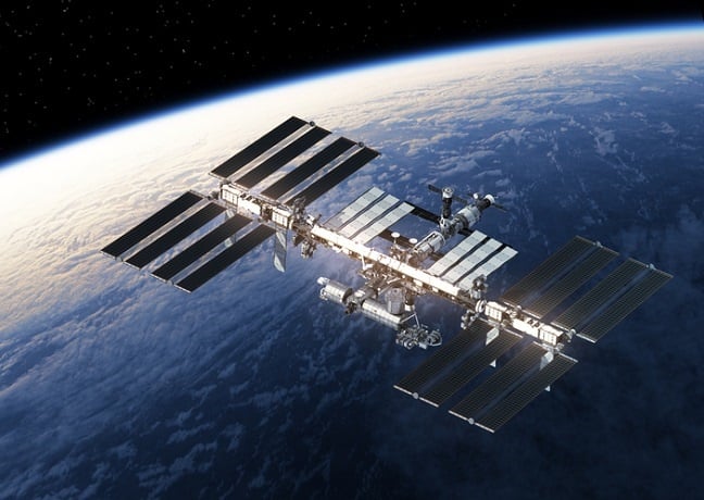
Twenty-five years after the International Space Station was established, space exploration has advanced significantly.
Low Earth Orbit (LEO) holds immense potential as a frontier for technological innovation and human aspiration. However, space tourism remains an elusive dream.
The initial idea revolved around creating “a platform app for space travel,” inspired by my ambition to make this dream a reality. A survey was conducted to begin exploring the concept.
Initial Survey & Interviews
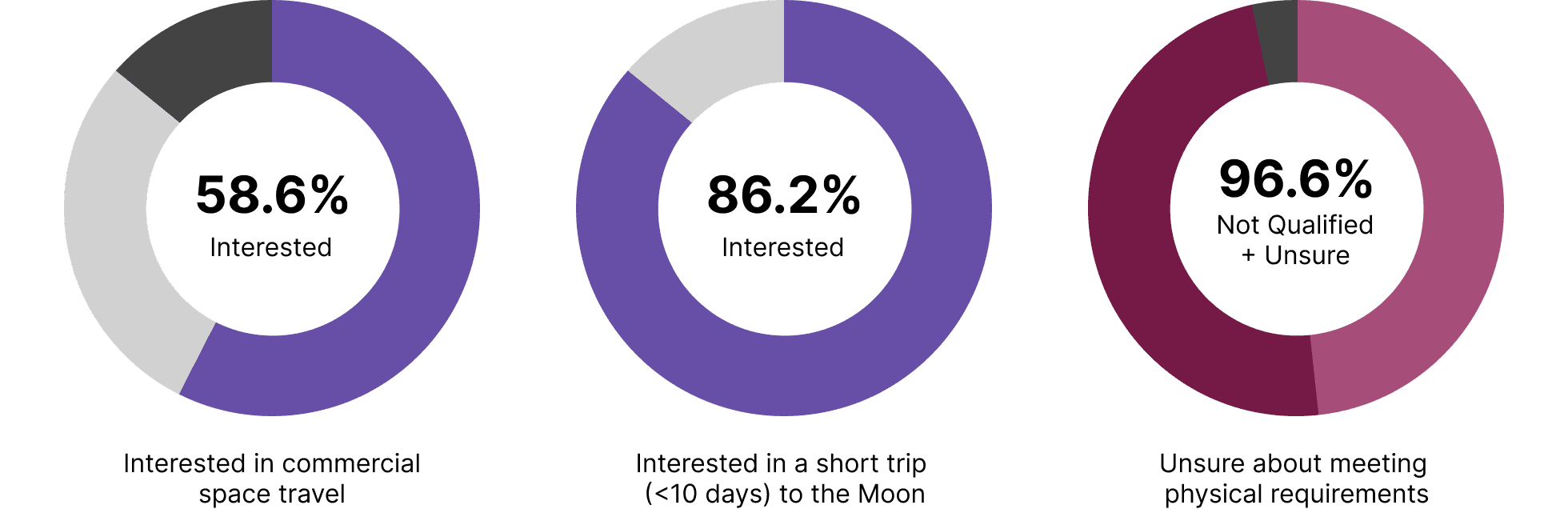
A total of 29 participants provided insightful responses. Most showed interest in space travel, particularly shorter and more feasible trips.
However, 96.6% of participants felt unqualified or uncertain about their physical capabilities for such a journey.
This raised a critical question: Why do people feel physically unqualified despite their interest in space travel?
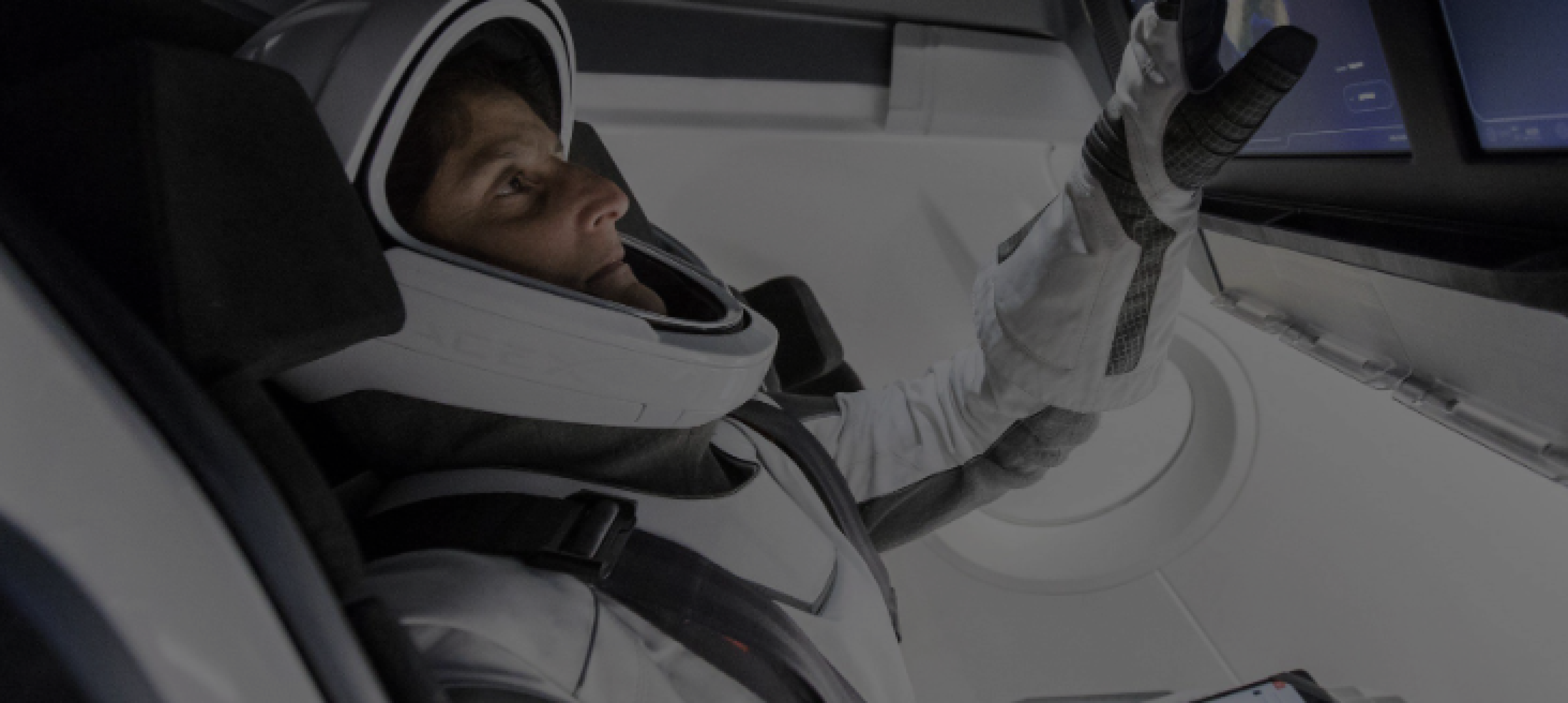
Technical Uncertainty
“Flying in a rocket is like in a bomb, but to space. (All we can do is) Hope it doesn’t fail.”
- Benjamin Stuhr, Ex-SpaceX Intern
Fear of Unknown
“Movies make me think it is not something impossible, but I think we are not there yet.
I would not want to go.”
- Semy Kong, RIT Student
Refining Question
Based on the findings from the initial survey and interviews, I recognized the need to broaden the scope of the project. It became clear that the focus should extend beyond creating visually appealing user interfaces to designing a holistic user experience and service.
This approach aims to challenge the boundaries of design by evoking emotional responses and encouraging users to reflect on the future. As a result, the project evolved into a critical and speculative design exploration, centered around the following problem statement.
Tools to Convince People
To develop designs that are communicative and intuitive, I focused on three key concepts, incorporating user testing to refine the approach.
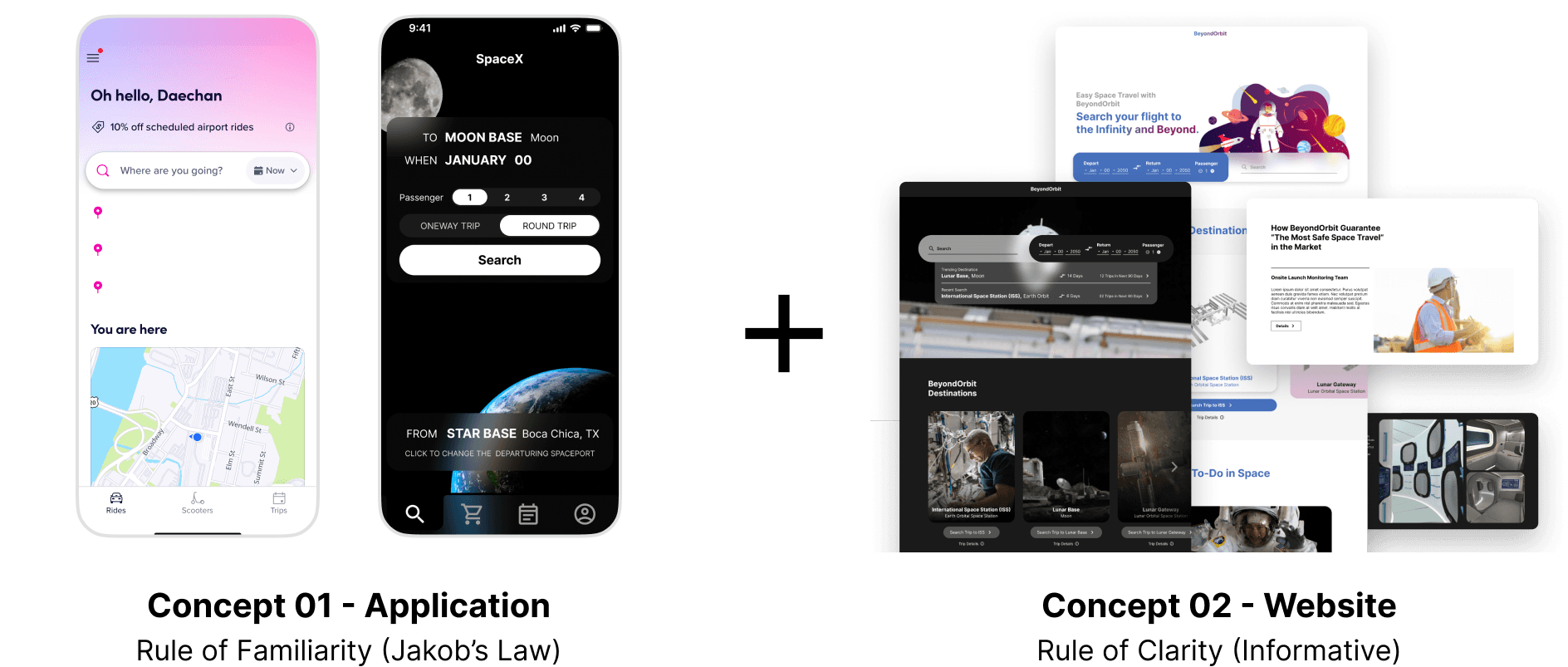
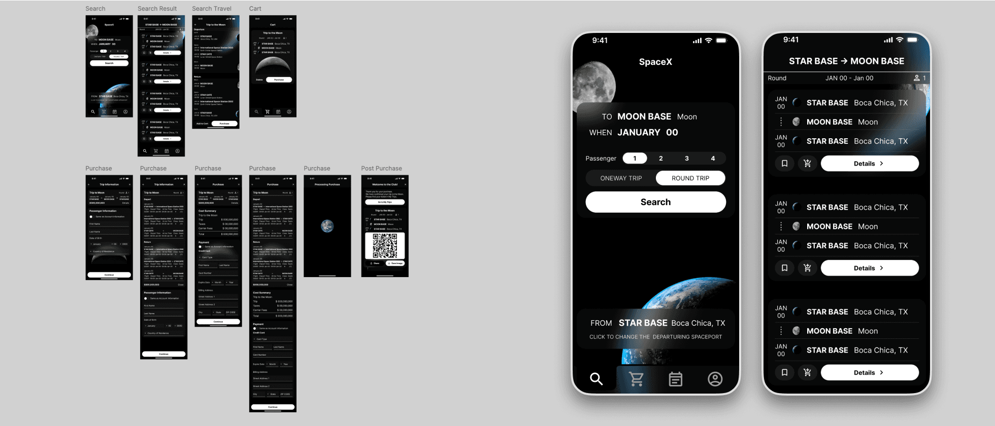
Concept 01 - Application
Rule of Familiarity (Jakob’s Law)
I developed an application mockup based on existing airline and ride-share apps, allowing users to easily understand the interface and reducing hesitation related to the unfamiliar concept of space travel.
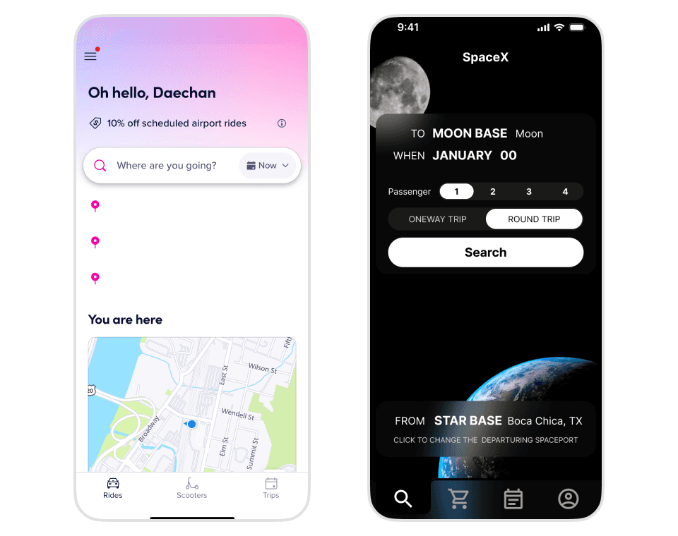
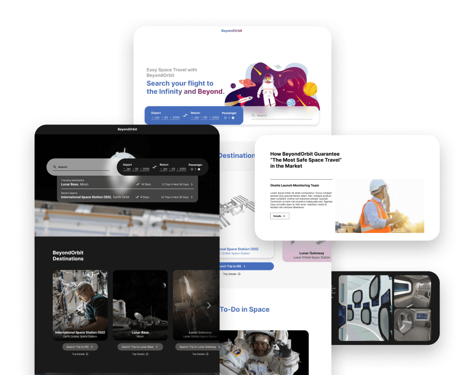
Concept 02 - Website
Rule of Clarity
Fear of the unknown often stems from a lack of information. Clear, concise content can alleviate stress and empower users to engage with the service.
Three iterations of the website were created, each with distinct content and visuals tailored to participants’ varying interests.
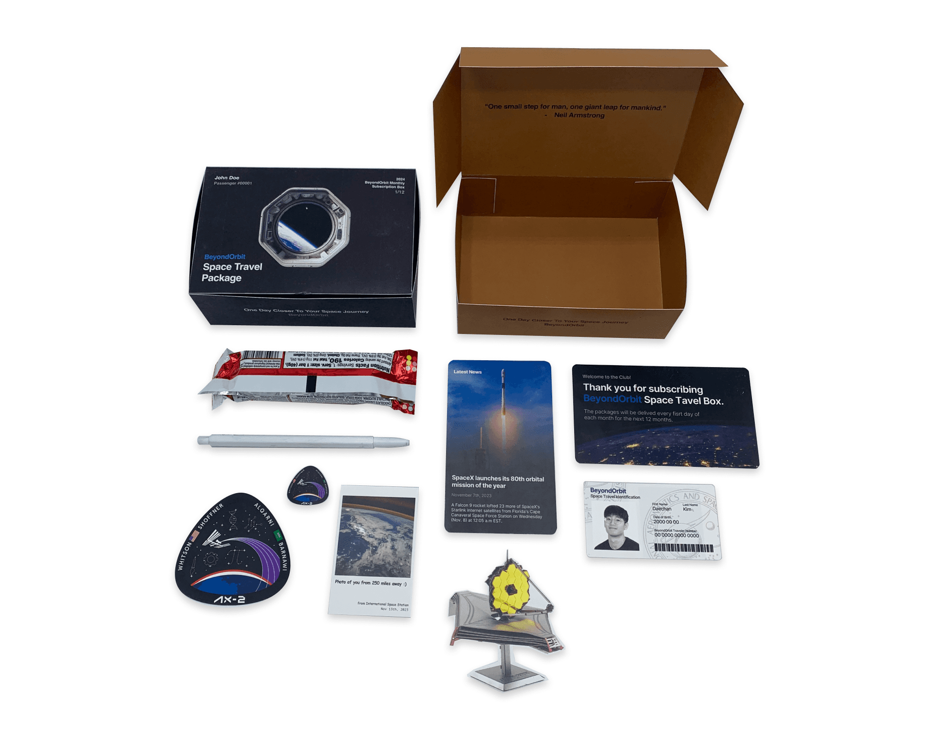
Concept 03 - Subscription Service
Action of Friendliness
Space travel is often seen as an exclusive service available only to a select few. This mindset can be addressed by making the concept more accessible.
The user would receive a monthly subscription package featuring small items and newsletters, helping to raise awareness and maintain engagement.
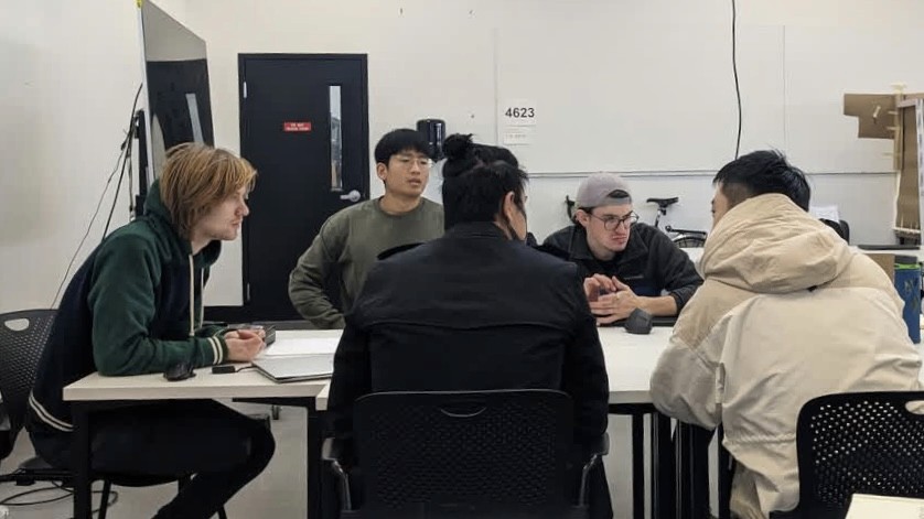
Workshop
A design workshop with three participants tested the prepared materials and led to narrowing down the final product concept.
The feedback revealed that Concept 01, which focused on familiarization, generated excitement and engagement among participants.
However, two participants suggested integrating the informational aspects from Concept 02 to enhance the service’s persuasiveness.
While Concept 03 received some positive feedback, it raised concerns about its applicability to a wider audience, as it might not effectively engage the mass public in identifying potential customers.
Persona
Creating personas was a crucial step in visualizing the target users for the service. This allowed me to tailor the content and messaging to resonate more deeply with the intended audience.
The primary personas for this service are early adopters of space tourism, individuals passionate about space and science, and those eager to witness the future of humanity in space.

Persona 01
Michelle
University Graduate Student, Space Enthusiast, Participating in a University Space Research

Persona 02
Ramon
Physicist, Professor, Space Enthusiast, Research Advisor at NASA
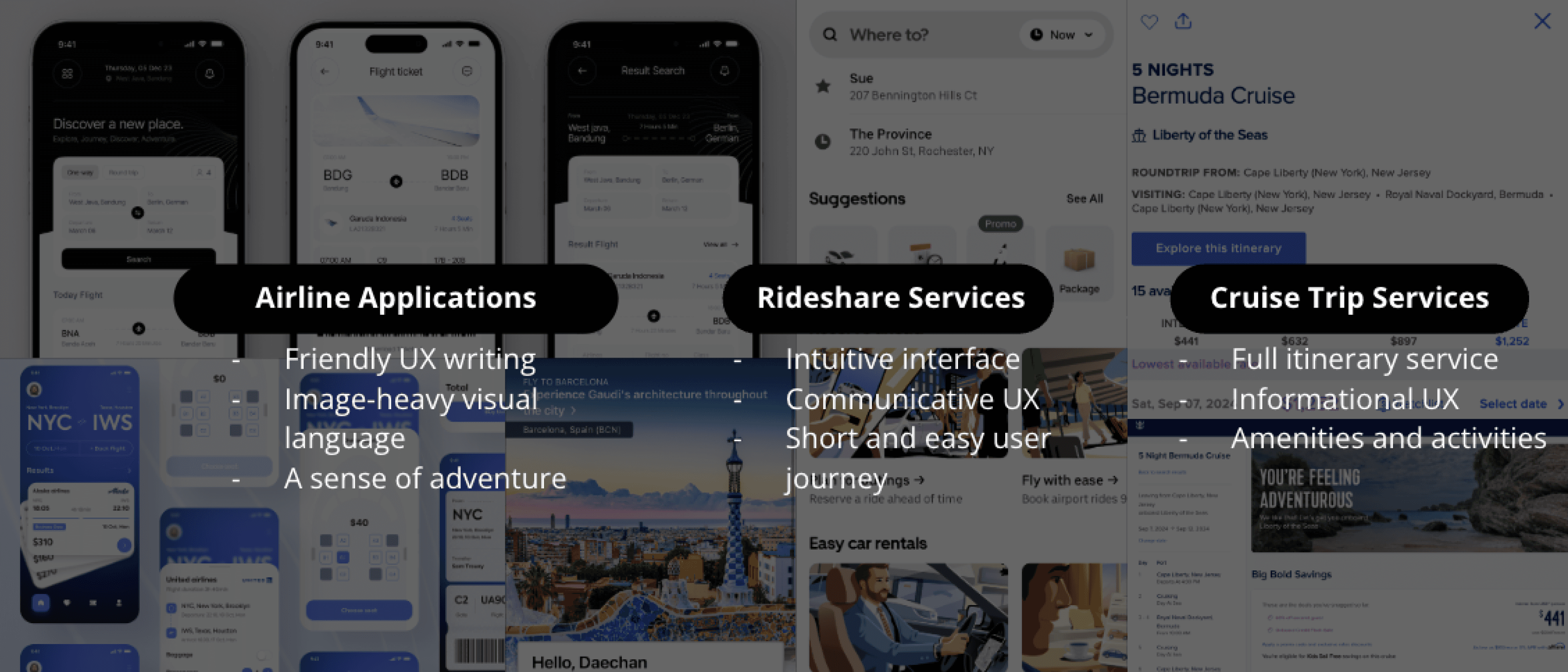
Design References
Flow Chart
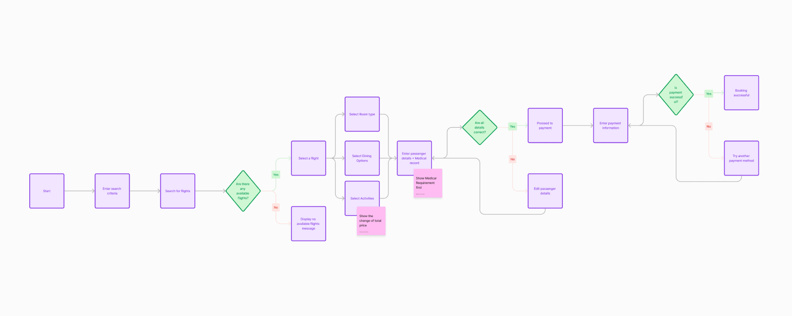
The flowchart laid the groundwork for the basic user flow, from opening the app to receiving a space ticket. This early-stage flowchart was critical in identifying the key screens and interactions necessary for the first iteration of the design.
As the product evolved, a more comprehensive flowchart was developed to accommodate additional details and enhance the user experience.
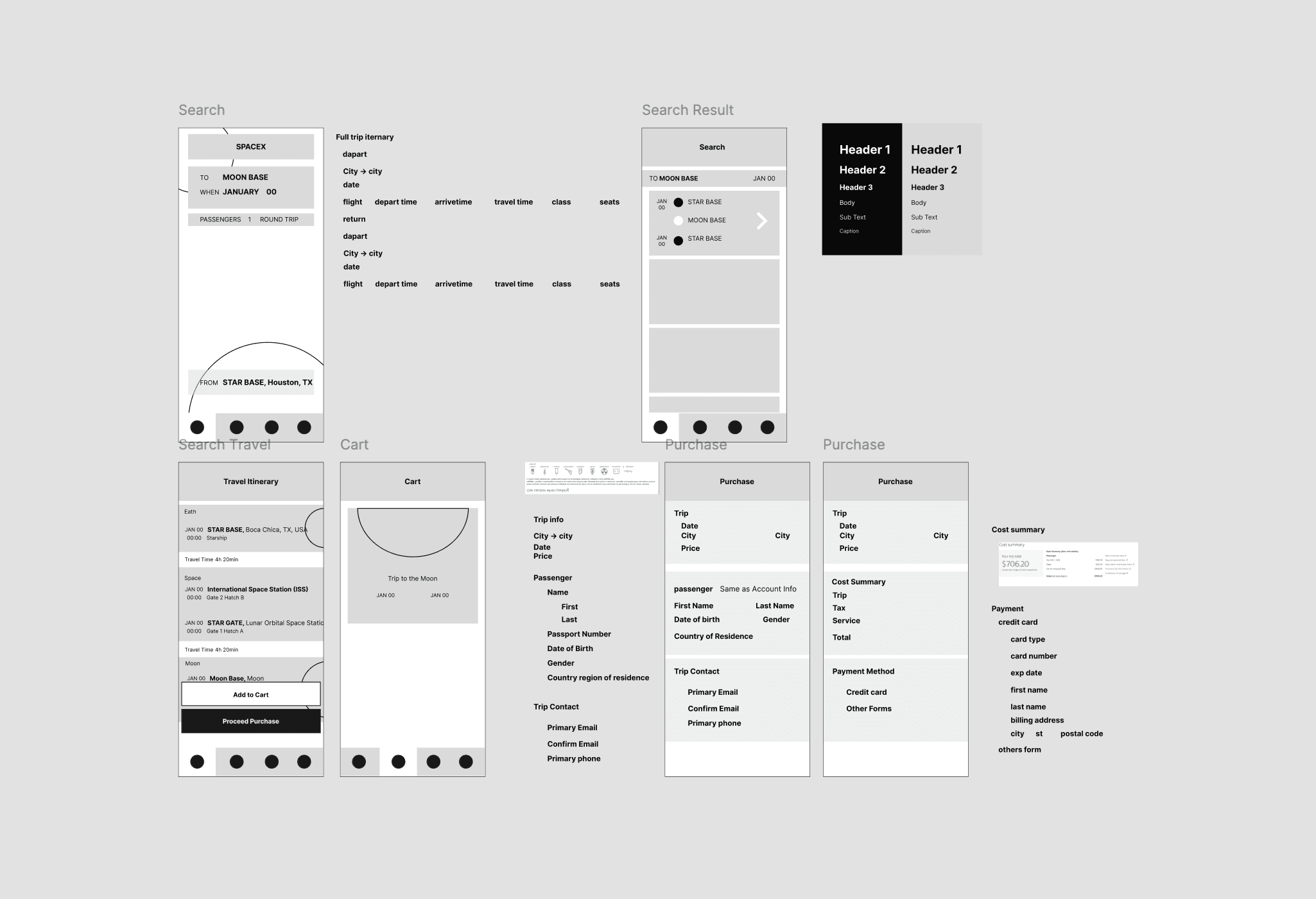
Wire-framing
Based on the initial flowchart, I developed wireframes to visualize the basic information structure and visual hierarchy of the app.
During this phase, I used visual references from existing services to inform key elements of the design.
The wireframes allowed me to quickly test different information structures, helping refine the app’s layout and content flow.
Prototyping and User Testings
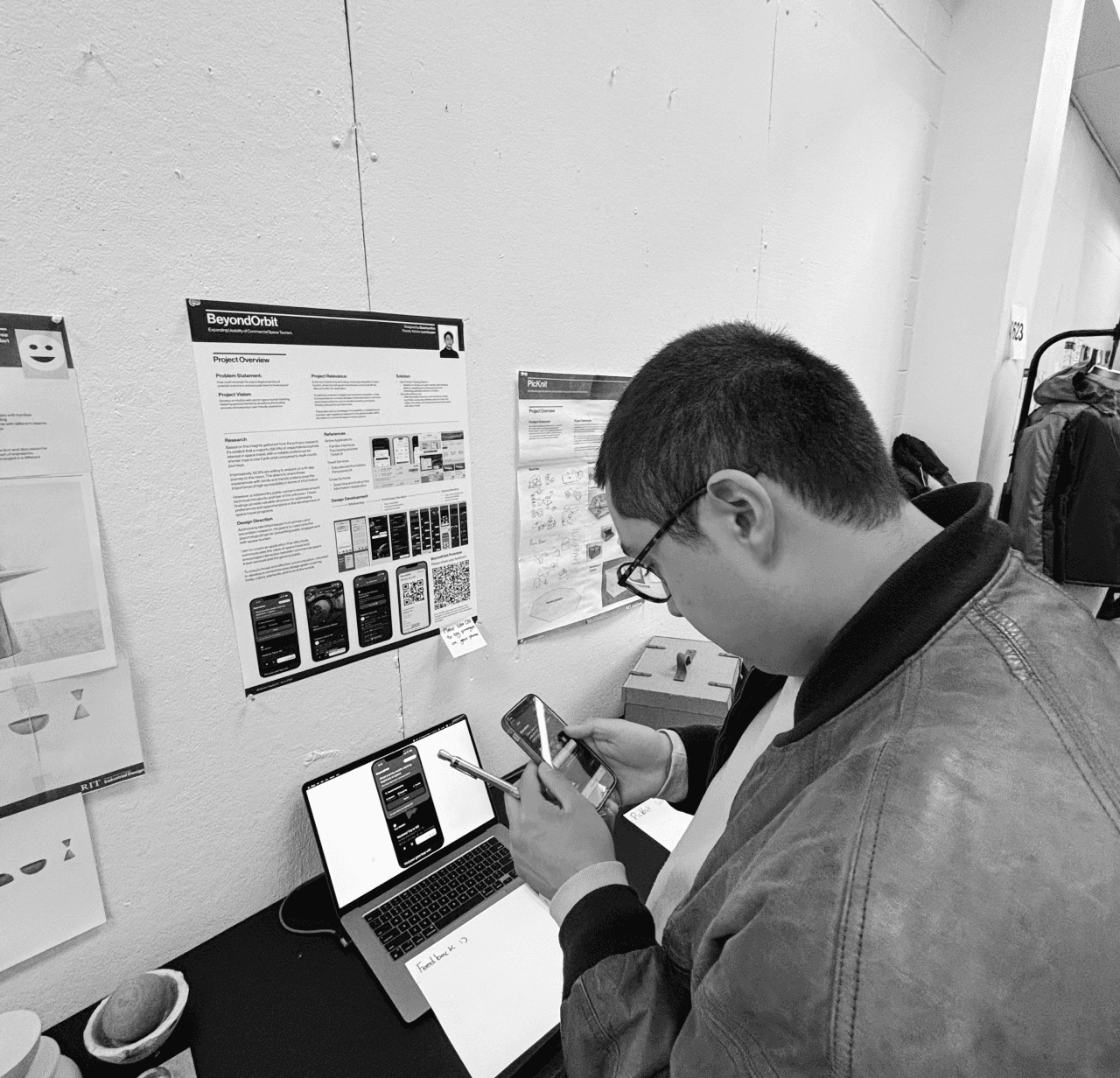
User Testing Feedback
Positives
+
Familiar Interface
User interface is familiar and intuitive in most of the screens.
+
Positive leave behind
Exiting testing with a ticket was rewarding and felt like getting a real ticket.
Negatives
-
Unclear Visual Hierarchy
Information appeals to be overload in search result screen.
-
Lacking Actuality
Over simplified ticketing process caused disconnection from the reality.
Product Goals
The overall goal of the product is to create an experience that is friendly, intuitive, and persuasive, ultimately making space tourism more feasible for users.
Friendliness
The user interface should use casual, everyday language to make space travel feel more accessible and relatable.
Intuitiveness
The design system must effectively communicate with a diverse range of users from various cultures, ensuring a seamless experience for all.
Persuasiveness
User experience should inform and enhance understanding of space tourism, helping to overcome psychological barriers to the unknown.
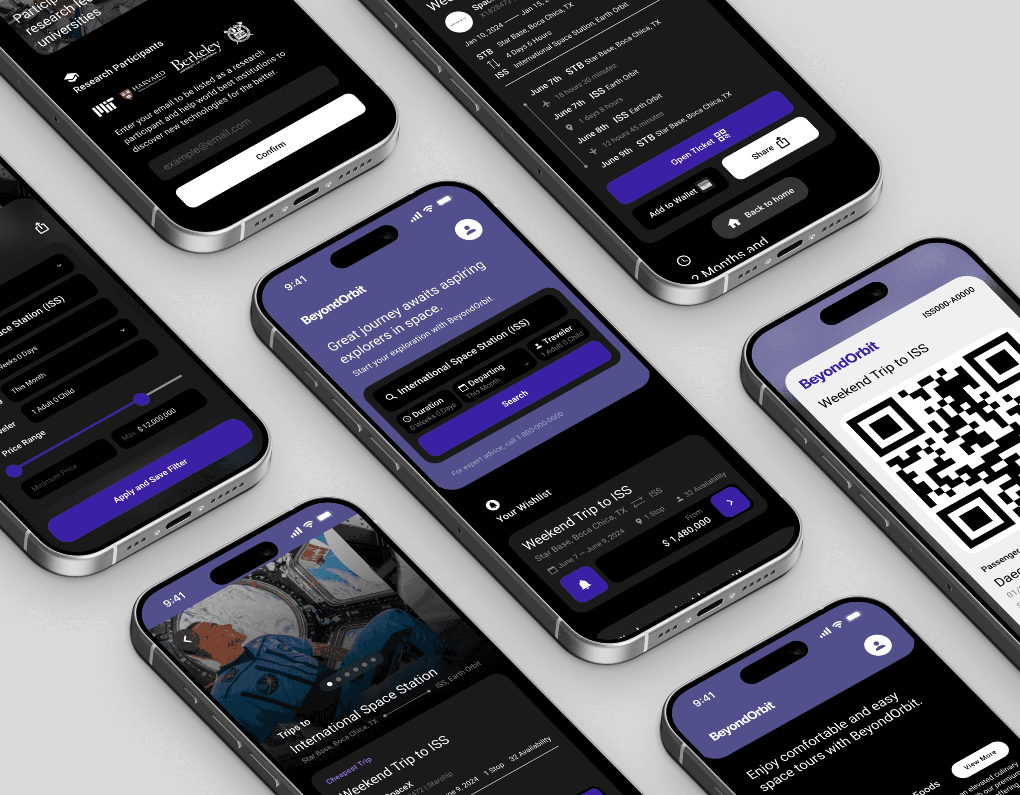
Final Design Concept
BeyondOrbit
BeyondOrbit is designed to help the general public easily explore space tourism opportunities while breaking down psychological barriers, making space travel accessible to everyone.
Its intuitive interface encourages users to engage with the experience confidently, allowing them to venture into new life experiences.
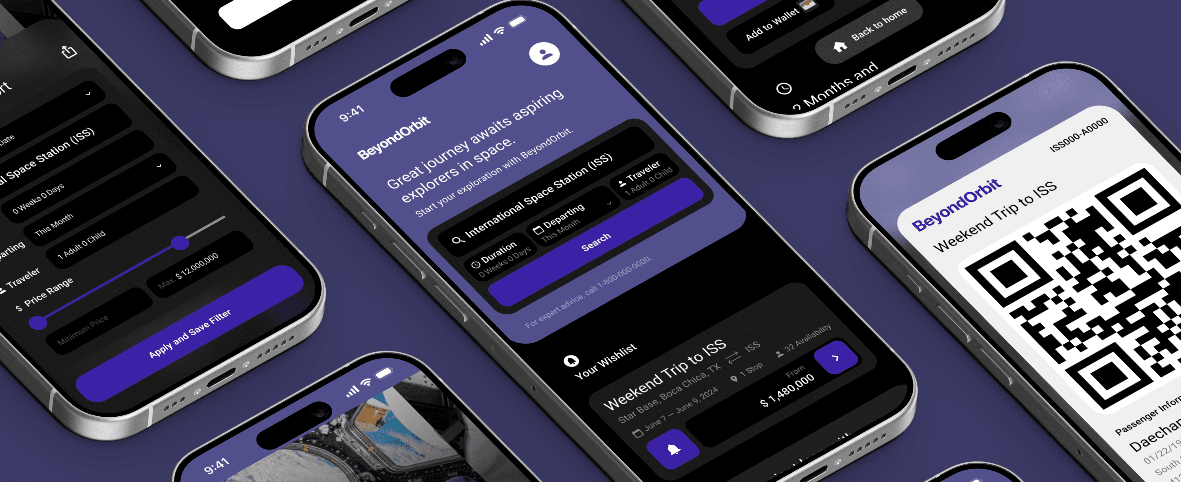
Find Trip
The process of finding a space tour begins with a search bar located on the homepage. This streamlined feature guides users toward the ticketing process. The prominent call-to-action invites users to explore and test out the service.
However, the search bar only takes up half of the screen, leaving ample space for additional information about space tourism, catering to users who seek to learn more.
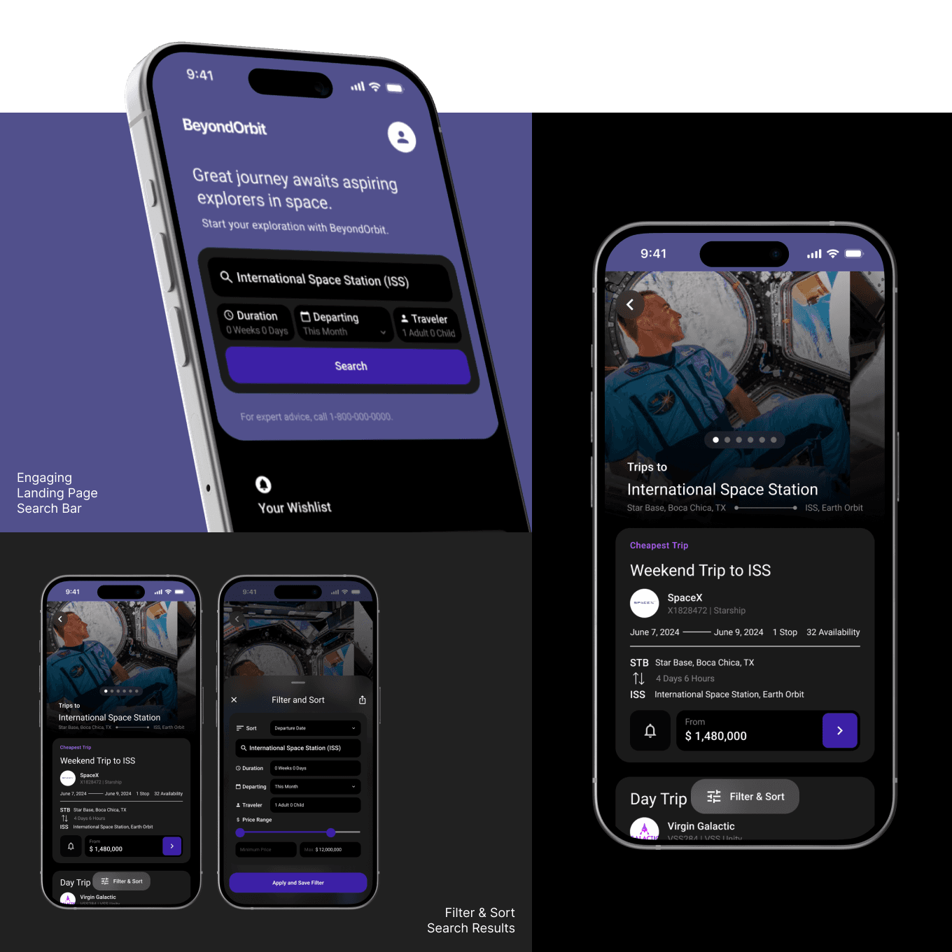
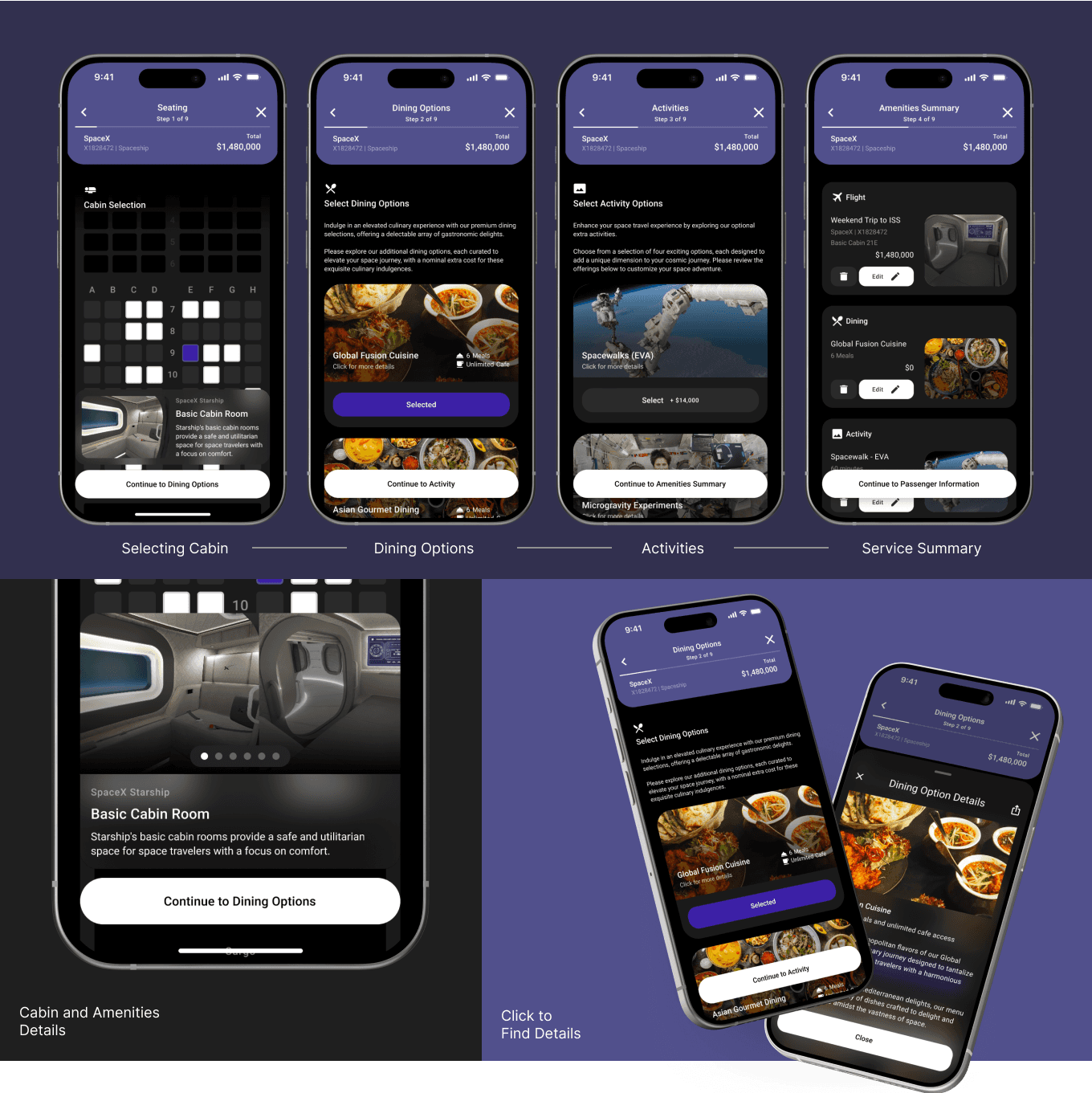
Selecting Tickets and Options
Ticket selection and customization are broken down into smaller, manageable steps to prevent information overload. This approach provides users with the flexibility to tailor their desired trip while ensuring authenticity.
Users can explore detailed options by clicking on service descriptions, which open pop-up cards within the ticketing flow, maintaining a smooth user journey.
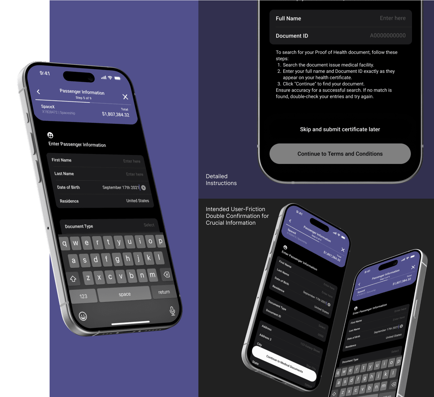
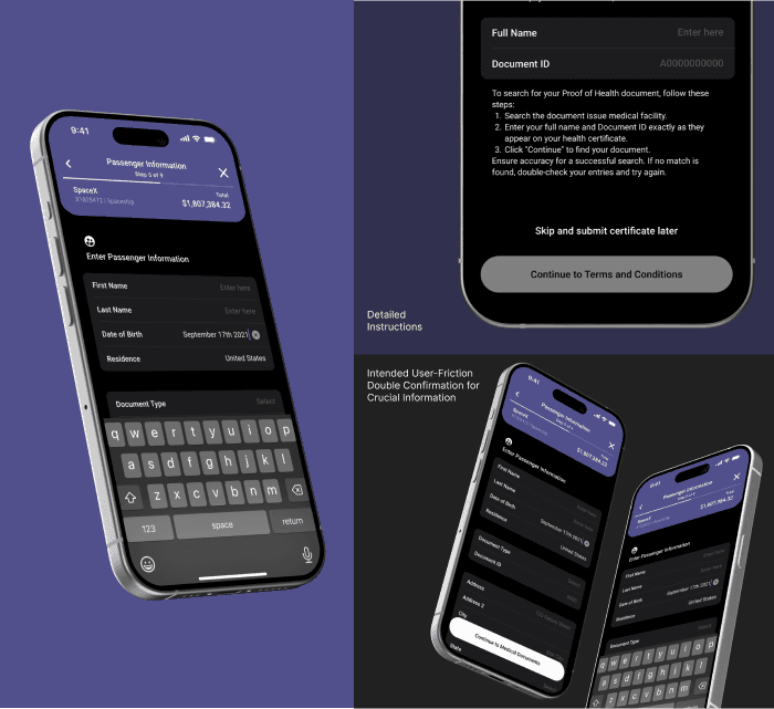
Enter Passenger Information
To gather sensitive passenger information, this step clearly explains the necessity and purpose of each data request, promoting user trust and understanding.
The inclusion of terms and conditions introduces purposeful friction, emphasizing the importance of this process and enhancing the overall realistic experience.
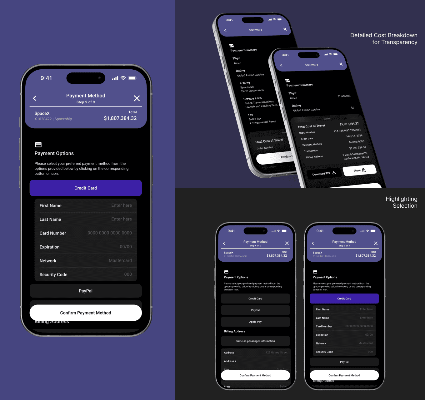
Purchasing Ticket
The ticket purchasing process has been simplified to minimize steps, while intentional user friction has been integrated to confirm trip details.
A summary breakdown of the price ensures that users fully understand their purchase, instilling confidence in the decision-making process.
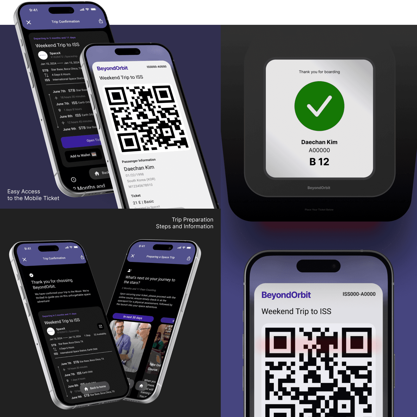
Receiving Ticket
Once the purchase is confirmed, users receive their space tourism ticket immediately, maintaining engagement throughout the journey.
The confirmation page provides additional preparation information and steps to help users get ready for their upcoming trip.
More Details
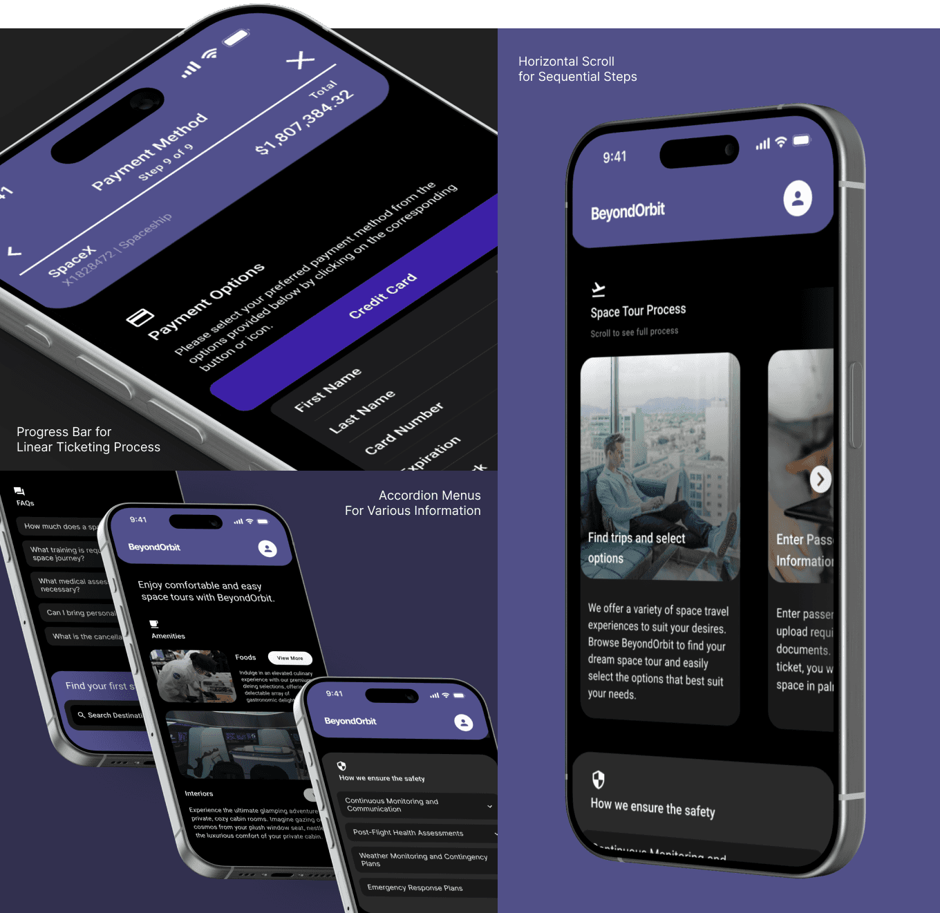
Progress bars indicate the user’s current position in the ticketing process, reducing the stress of navigating a linear flow.
To accommodate varying user needs, the homepage features an accordion menu, organizing and presenting content efficiently.
Horizontal scroll navigation is utilized to indicate the progression of time, guiding users seamlessly through the steps.
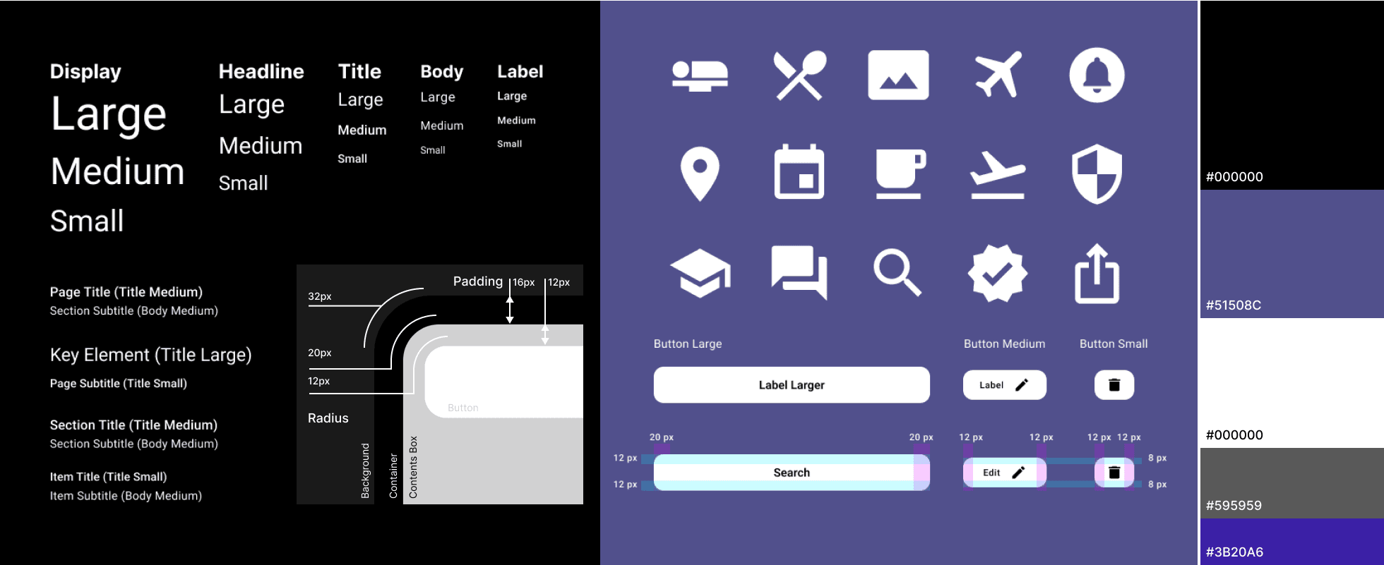
Design Guide
A comprehensive design system and guide were created to ensure consistency across screens. This system included fundamental design elements, such as typography, key colors, icons, padding, and corner radius, all contributing to the cohesive look and feel of the app.
Results
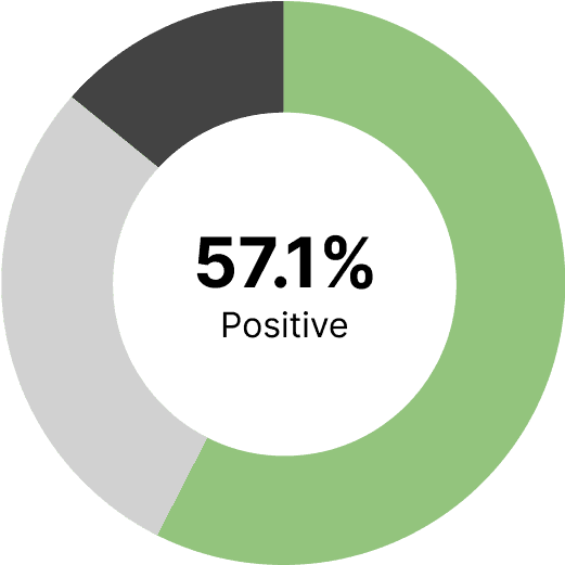
The design concept was tested with 7 users to evaluate its effectiveness in meeting the goals set during the second iteration: friendliness, intuitiveness, and persuasiveness.
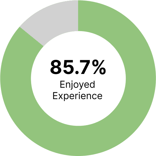
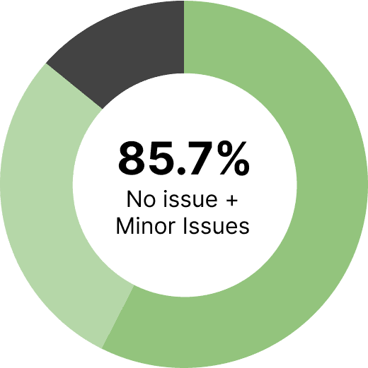
85.7% of participants reported enjoying the prototype, indicating a positive overall experience.
57% of users successfully completed the ticketing process without any issues, while 28% encountered only minor challenges.
57% of participants stated that the experience positively influenced their perspective toward space tourism.
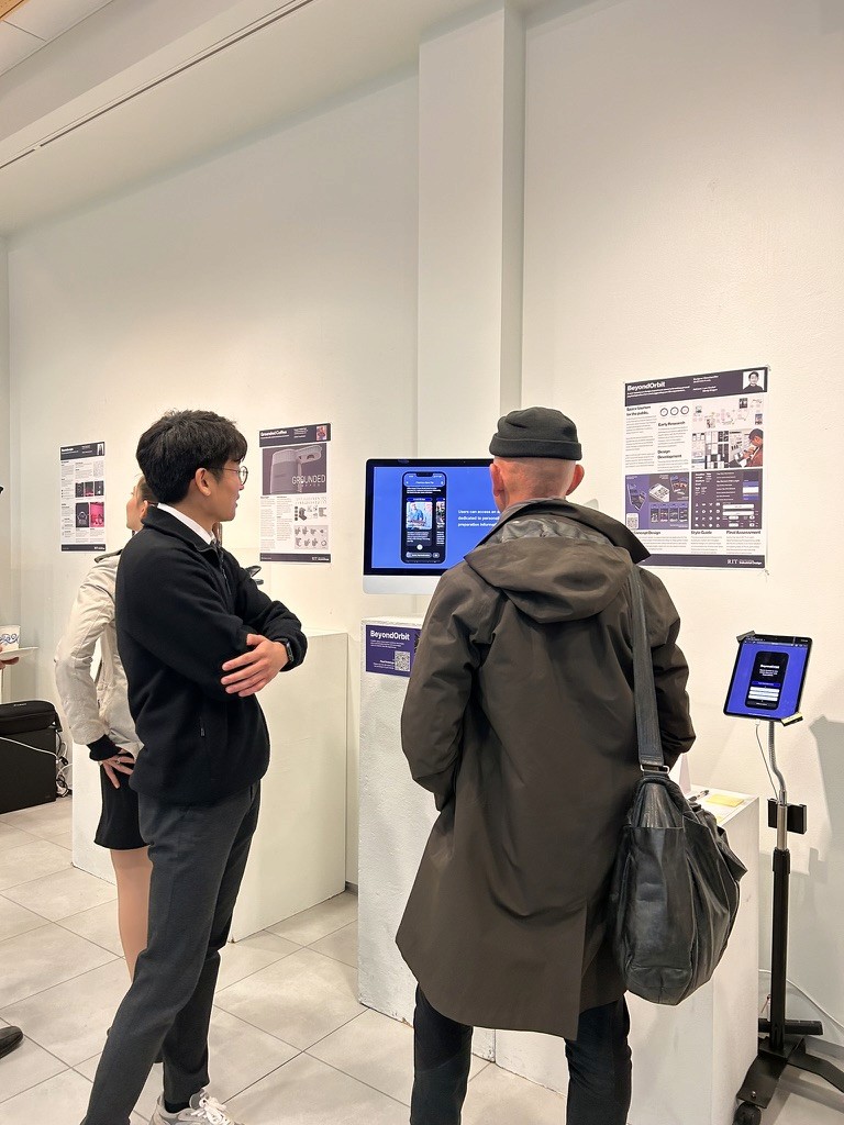
Exhibition Feedback
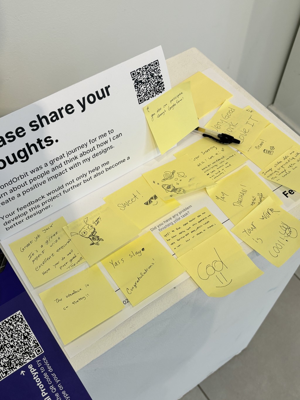
At first, space tourism felt too far from reality but this experience was very familiar and easy, which helped a lot! I am ready to travel :)
Super interesting idea, love it! But some screens are a bit hard to read, and there is some room for improvements in the hierarchy.
Takeaways
The most valuable lesson I experienced through this project was it is really important to listen to the users and communicate constantly by testing product and share ideas.
I was able to create this comprehensive service and experience design only with the help of people who were actively participated in my research and communications.